- A reader gave us a research report stating the high-yield spread is one of the best macro indicator to predict tactical shifts of asset classes.
- If that time series is that good with asset classes across the business cycle, we thought it should be just as good with sectors.
- We found that the high-yield spread helps select the right sectors among US equities, but it’s not the best one for that purpose.
- The Conference Board Leading Economic Indicator (LEI) is better than the high-yield spread as it creates fewer false signals.
Introduction
A reader shared external research stating that the high-yield spread might be one of the best macroeconomic indicators for tactically shifting between various asset classes ETFs depending on the business cycle. In this article, we will examine if we can use the same signal to call sectors.
Definition
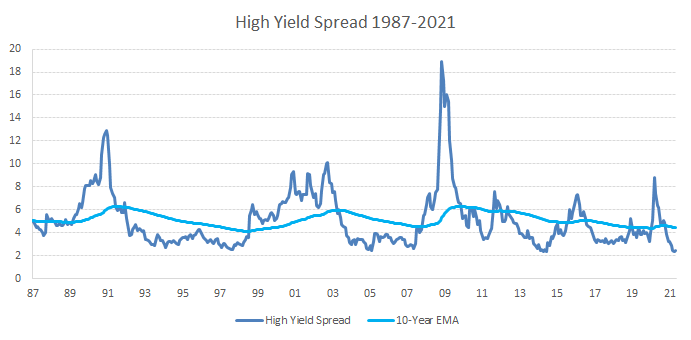
For those unfamiliar, the high-yield spread is simply the difference between the borrowing rate for below investment grade corporate bonds and a treasury bond measure. This analysis uses the Barclays Corporate High Yield Index minus the 10-Year Treasuries Yield because it has data going as far as 1987. A similar spread is available in real-time on the FRED website.
Model
The blue line is the 10-year exponential moving average. We use that line to gauge the level of the high-yield spread. It is either above or below that level. We are also going to look at the direction. To do so, we calculate the trailing three-month change. It is either increasing or decreasing. With these two parameters, we split the indicator into four phases, as shown below.
The high-yield spread phases are counterintuitive because they act as the reverse of the business cycle phases. For example, when the high yield spread is above its 10-year EMA and rising (red column), this means that credit conditions are tightening, and investors are demanding higher compensation for taking on the risk of their principal declining.
Decline Phase
Economic output and corporate earnings are negative;
Outperformers: Staples (XLP).
Recovery Phase
Economic output and corporate earnings are recovering;
Outperformers: Materials (XLB) and discretionary (XLY).
Early Phase
Economic output and corporate earnings are growing;
Outperformers: Energy (XLE), financials (XLF) and industrials (XLI).
Late Phase
Economic output and corporate earnings are slowing;
Outperformers: Info tech (XLK) and health care (XLV).
Strategy
Just like our Tactical Sector Rotation Strategy discussed in our popular article “This Sector Rotation Strategy Made 17% Each Year Since 1991“, this High-Yield Spread (HYS) Model is investing in one to three SPDR Select Sector ETFs, as shown in the outperformers above. It is rebalanced monthly, but it doesn’t mean that it trades every month as it depends on a phase change.

At first glance, the relative performance of the HYS Model is quite strong (green line). However, there are a few years with severe underperformance against the S&P 500, notably in 1997, 1999, 2017, and 2020. Also, it doesn’t help that the HYS Model lagged in three of the five most recent years.
| Year | HYS Model | S&P 500 | Difference |
| 1991 | 33.4 | 30.5 | 3.0 |
| 1992 | 8.0 | 7.6 | 0.4 |
| 1993 | 27.1 | 10.1 | 17.0 |
| 1994 | 14.1 | 1.3 | 12.7 |
| 1995 | 38.7 | 37.6 | 1.1 |
| 1996 | 41.3 | 23.0 | 18.3 |
| 1997 | 26.8 | 33.4 | -6.6 |
| 1998 | 36.0 | 28.6 | 7.4 |
| 1999 | 6.6 | 21.0 | -14.5 |
| 2000 | 15.7 | -9.1 | 24.8 |
| 2001 | -10.1 | -11.9 | 1.8 |
| 2002 | -16.5 | -22.1 | 5.6 |
| 2003 | 33.2 | 28.7 | 4.5 |
| 2004 | 8.2 | 10.9 | -2.7 |
| 2005 | 15.9 | 4.9 | 11.0 |
| 2006 | 24.2 | 15.8 | 8.4 |
| 2007 | 10.2 | 5.5 | 4.7 |
| 2008 | -20.7 | -37.0 | 16.3 |
| 2009 | 49.5 | 26.5 | 23.0 |
| 2010 | 22.8 | 15.1 | 7.7 |
| 2011 | 6.4 | 2.1 | 4.3 |
| 2012 | 18.3 | 16.0 | 2.3 |
| 2013 | 36.2 | 32.4 | 3.8 |
| 2014 | 15.2 | 13.7 | 1.5 |
| 2015 | 1.8 | 1.4 | 0.4 |
| 2016 | 24.7 | 12.0 | 12.7 |
| 2017 | 6.2 | 21.8 | -15.6 |
| 2018 | 1.0 | -4.4 | 5.4 |
| 2019 | 30.7 | 31.5 | -0.8 |
| 2020 | 12.4 | 18.4 | -6.0 |
| 2021 | 23.7 | 11.8 | 11.9 |
Comparison
The table below compares the various performance and risk metrics of the High-Yield Spread (HYS) Model versus our original Leading Economic Indicator (LEI) Model versus the S&P 500 Total Return. The inception is January 1st, 1991, so it encompasses four business cycles in total.
Performance & risk metrics as of May 31st, 2021
| Since Inception | HYS Model | LEI Model | S&P 500 TR |
| Ann. Return (%) | 16.24 | 18.52 | 10.57 |
| Standard Dev. (%) | 15.55 | 15.14 | 14.47 |
| Max Drawdown (%) | -35.92 | -42.45 | -50.95 |
| Sharpe Ratio | 0.92 | 1.06 | 0.63 |
| Sortino Ratio | 1.29 | 1.51 | 0.82 |
| Index Correlation | 0.78 | 0.83 | 1.00 |
| Upside Capture | 1.05 | 1.09 | 0.00 |
| Downside Capture | 0.75 | 0.69 | 0.00 |
| Portfolio Beta | 0.84 | 0.87 | 1.00 |
| Portfolio Alpha (%) | 5.67 | 7.95 | 0.00 |
Our original LEI Model generates 2.3% more annualized return over the last 30 years than the HYS Model. However, the maximum drawdown of the HYS Model is lower by 6.5%, probably because it is more sensitive to changes.
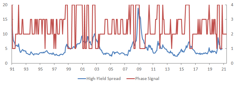
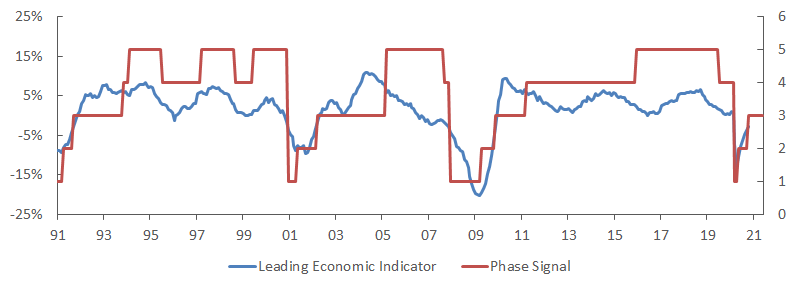
However, this oversensitivity creates false signals, so both the upside and downside capture are worse. The graphs above compare the signal of both models. There are at least four times more trades with the HYS Model.
Conclusion
Based on our backtesting results, we have shown that the high-yield spread is decent at calling a sector rotation. It serves as a great barometer to assess the appetite for risky assets relative to a risk-free asset. However, the strategy has an important issue: it is more prone to whipsaws that create false signals that harm its performance.
We believe the Conference Board Leading Economic Indicator is superior because 1) it has more historical data, 2) it is less volatile, 3) it is a composite of ten macroeconomic indicators, and 4) it has a higher correlation with the business cycle. A full presentation is available on our website for those interested in learning more about our Tactical Sector Rotation.